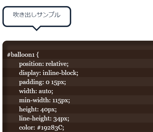
CSSのみで吹き出し(バルーン)を作るサンプルです。
SVGで作る方法もありますが、CSSなので比較的とっかかりやすい印象です。
また、画像を作成する手間も省け、内容が変動する場合に重宝します。
下から吹き出しバージョン
吹き出しサンプル
#balloon1 {
	position: relative;
	display: inline-block;
	padding: 0 15px;
	width: auto;
	min-width: 115px;
	height: 40px;
	line-height: 34px;
	color: #19283C;
	text-align: center;
	background: #FFF;
	border: 3px solid #19283C;
	z-index: 0;
	margin: 0 0 20px;
	border-radius: 10px;
}
#balloon1:before {
	content: "";
	position: absolute;
	bottom: -8px; left: 50%;
	margin-left: -9px;
	width: 0px;
	height: 0px;
	border-style: solid;
	border-width: 9px 9px 0 9px;
	border-color: #FFF transparent transparent transparent;
	z-index: 0;
}
#balloon1:after {
	content: "";
	position: absolute;
	bottom: -12px; left: 50%;
	margin-left: -10px;
	width: 0px;
	height: 0px;
	border-style: solid;
	border-width: 10px 10px 0 10px;
	border-color: #19283C transparent transparent transparent;
	z-index: -1;
}
左から吹き出しバージョン
吹き出しサンプル
#balloon2 {
	position: relative;
	display: inline-block;
	padding: 0 15px;
	width: auto;
	min-width: 115px;
	height: 40px;
	line-height: 34px;
	color: #19283C;
	text-align: center;
	background: #FFF;
	border: 3px solid #19283C;
	z-index: 0;
	border-radius: 10px;
}
#balloon2:before {
	content: "";
	position: absolute;
	top: 50%; left: -8px;
	margin-top: -9px;
	width: 0px;
	height: 0px;
	border-style: solid;
	border-width: 9px 9px 9px 0;
	border-color: transparent #FFF transparent transparent;
	z-index: 0;
}
#balloon2:after {
	content: "";
	position: absolute;
	top: 50%; left: -12px;/*位置調整*/
	margin-top: -10px;
	width: 0px;
	height: 0px;
	border-style: solid;
	border-width: 10px 10px 10px 0;
	border-color: transparent #19283C transparent transparent;
	z-index: -1;
}