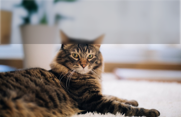
ぼかしている画像の一部が鮮明に見える表現です。
実際は、ぼかしている画像の上に切り抜かれた画像が置かれており、切り抜く部分をアニメーションで変化させています。
HTML
<div id="demo_area3">
    <img class="demo_img demo_blur3" src="https://www.kipure.com/img/demo/cat/011.jpg">
    <img class="demo_img demo_clip3" src="https://www.kipure.com/img/demo/cat/011.jpg">
</div>
CSS
#demo_area3{
    height: 300px;
    position: relative;
}
img.demo_clip3 {
    clip:rect(50px,210px,130px,120px);
    position: absolute;
    left:0;
    animation: ani-name 6s infinite alternate;
}

img.demo_blur3 {
    filter: blur(2px) brightness(0.8);
    position: absolute;
}

@keyframes ani-name {
  0% {
  }
  25% {
    clip:rect(80px,210px,160px,120px);
  }
  50% {
    clip:rect(80px,150px,160px,50px);
  }
  75% {
    clip:rect(50px,150px,130px,50px);
  }
}
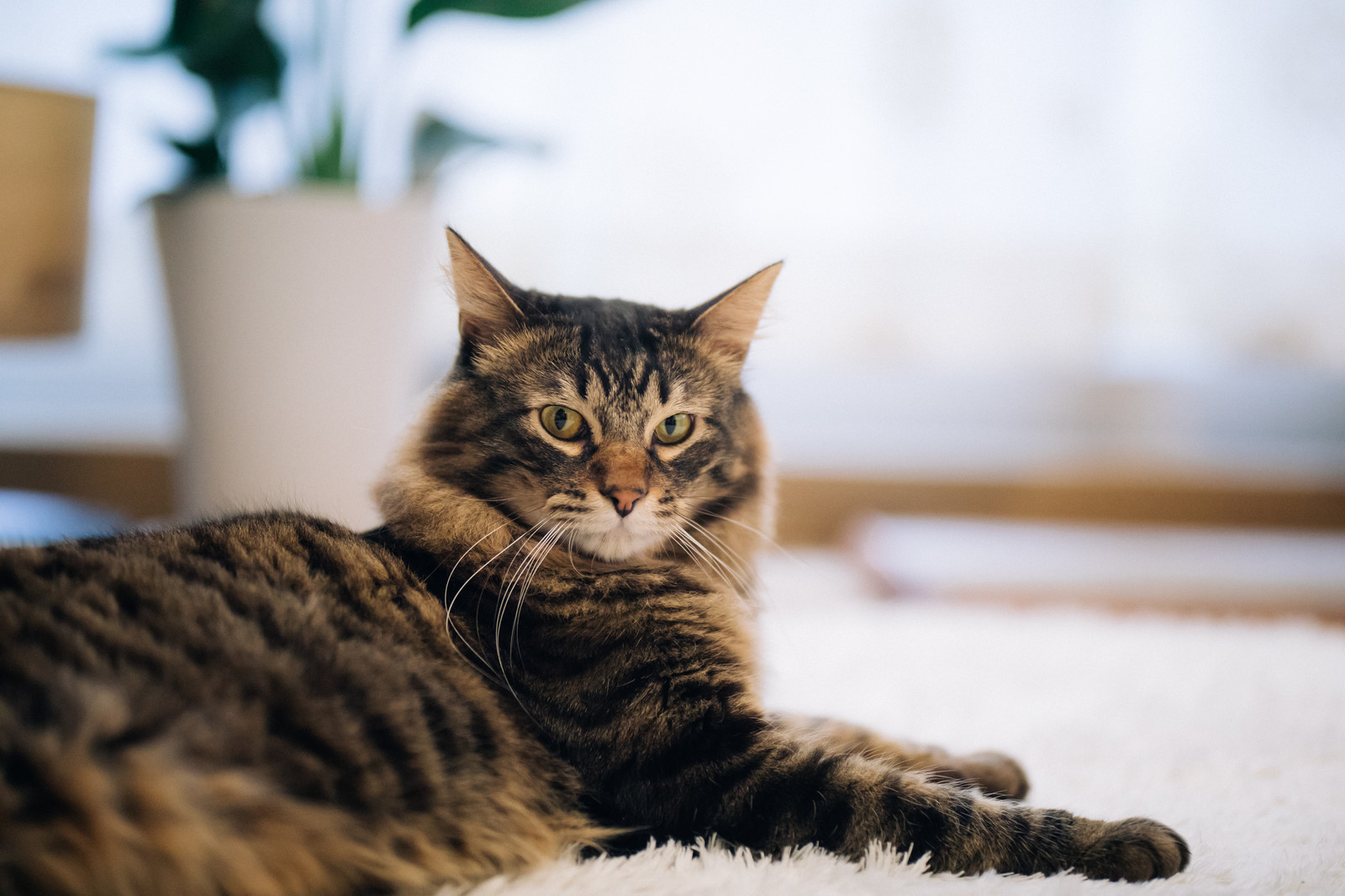
もっとシンプルに上に乗っている画像を全面で切り替えることで、このような表現も簡単にできます。
HTML
<div id="demo_area4">
    <img class="demo_img demo_blur4" src="https://www.kipure.com/img/demo/cat/011.jpg">
    <img class="demo_img demo_clip4" src="https://www.kipure.com/img/demo/cat/011.jpg">
</div>
CSS
#demo_area4{
    height: 300px;
    position: relative;
}
img.demo_clip4 {
    clip:rect(200px,300px,200px,0px);
    /* 上、右、下、左 */
    position: absolute;
    left:0;
    animation: ani-name2 2s infinite alternate;
}

img.demo_blur4 {
    filter: blur(2px) brightness(0.8);
    position: absolute;
}

@keyframes ani-name2 {
  0% {
  }
  100% {
    clip:rect(0px,300px,200px,0px);
  }
}