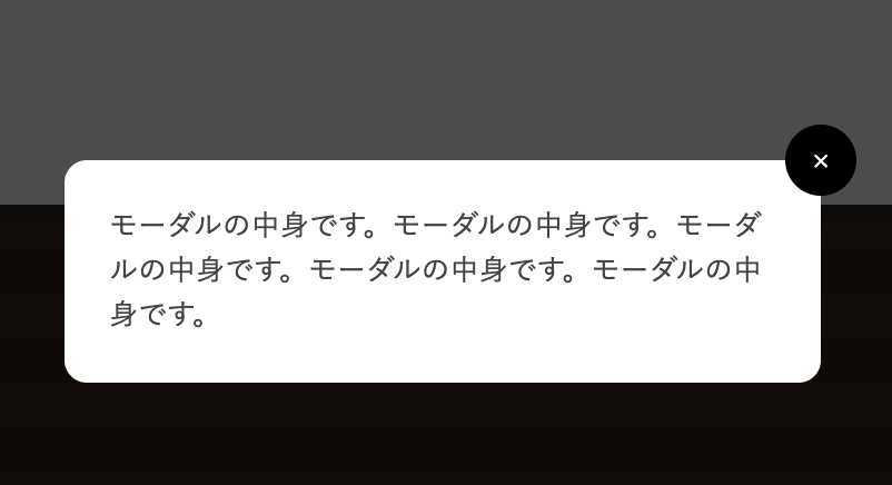
JavaScriptが苦手、あるいは使えない状況でも、モーダルの表現が可能です。
探すと素っ気ないモーダルはあるのですが、アニメーションの演出が付いているものがなかったので、作成しました。
スタイルシートの:targetがポイントになります。
まずはこちらをクリック。
aタグなので、URLに「#demo_modal」が付きます。
×
モーダルの中身です。モーダルの中身です。モーダルの中身です。モーダルの中身です。モーダルの中身です。
<a href="#demo_modal">モーダルを開く</a>


<div class="modal_box" id="demo_modal">
    <a href="#" class="close_bg"></a>
    <div class="modal_body">
        <a href="#" class="close">×</a>
        モーダルの中身です。モーダルの中身です。モーダルの中身です。モーダルの中身です。モーダルの中身です。
    </div>
</div>
HTMLはこうなっています。
次にCSSです。
.modal_box {
    display: none;
}

.modal_box:target {
    z-index:100;
    position: absolute;
    left: 0;
    top: 0;
    width: 100%;
    height: 100%;
    display: flex;
    align-items: center;
    justify-content: center;
}

.modal_box .modal_body {
    width: 300px;
    position: fixed;
    padding: 20px;
    background-color: #FFF;
    border-radius: 10px;
    top: 40%;
}

.modal_box:target .modal_body {
    animation: anime1 1s ease ;
}

@keyframes anime1 {
0% {
        top:45%;
        opacity: 0;
    }
100% {
        top:40%;
        opacity: 1;
    }
}

.modal_box .close {
    position: relative;
    display: block;
    text-decoration: none;
}
.modal_box:target .close {
    animation: anime2 2s ease ;
}
@keyframes anime2 {
0% {
        opacity: 0;
    }
50% {
        opacity: 0;
    }
100% {
        opacity: 1;
    }
}

.modal_box .close {
  right: -1rem;
  top: -1rem;
  width: 2rem;
  height: 2rem;
  position: absolute;
  display: flex;
  align-items: center;
  justify-content: center;
  background-color: black;
  border-radius: 50%;
  color: white;
  cursor: pointer;
}

.modal_box:target .close_bg {
  left: 0;
  top: 0;
  width: 100%;
  height: 100%;
  position: fixed;
  background-color: rgba(0,0,0,0.7);
  cursor: pointer;
} 