SVGのellipseを使って楕円を作り、円柱を表現してみます。
CSSの角丸(border-radius)で頑張って作ることもできますが、個人的にはこの方が簡単に円柱を作れました。
高さをCSSで調整してるので、棒グラフのデザインとしても使えます。
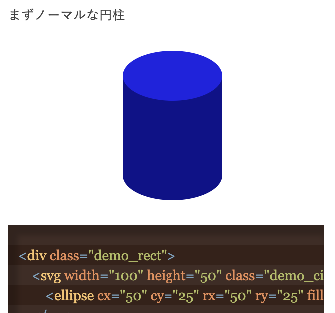
まずノーマルな円柱
<div class="demo_rect">
    <svg width="100" height="50" class="demo_circle1">
        <ellipse cx="50" cy="25" rx="50" ry="25" fill="#2222DD" />
    </svg>
    <svg width="100" height="50" class="demo_circle2">
        <ellipse cx="50" cy="25" rx="50" ry="25" fill="#111188" />
    </svg>
</div>
作りは簡単で、四角いdivの中に楕円が二つ上下にはみ出しています。
次は逆さまの円柱
<div class="demo_rect">
    <svg width="100" height="50" class="demo_circle1">
        <ellipse cx="50" cy="25" rx="50" ry="25" fill="#111188"/>
    </svg>
    <svg width="100" height="50" class="demo_circle2">
        <ellipse cx="50" cy="25" rx="50" ry="25" fill="#2222DD"/>
    </svg>
</div>
実は中の楕円の色が、下地のdivと同じ色になっている。
次は少しアレンジしたパターン
<div class="demo_rect2">
    <svg width="100" height="50" class="demo_circle1">
        <ellipse cx="50" cy="25" rx="47.5" ry="20" fill="#22DD22" stroke="#22AA22"  stroke-width="5"/>
    </svg>
    <svg width="100" height="50" class="demo_circle2">
        <ellipse cx="50" cy="25" rx="50" ry="25" fill="#118811"/>
    </svg>
</div>
上側にある楕円にフチをつけてその分小さくしています。
CSSはこちら
.demo_rect{
    width: 100px;
    height:100px;
    margin:50px auto 50px;
    background-color:#111188;
    position: relative;
}
.demo_circle1{
    top:-25px;
    position: relative;
    box-sizing: border-box;
}
.demo_circle2{
    bottom:-25px;
    left: 0;
    position: absolute;
}

.demo_rect2{
    width: 100px;
    height:100px;
    margin:50px auto 50px;
    background-color:#118811;
    position: relative;
}