画像の編集ソフトは不要です。
CSSの「clip」を使います。
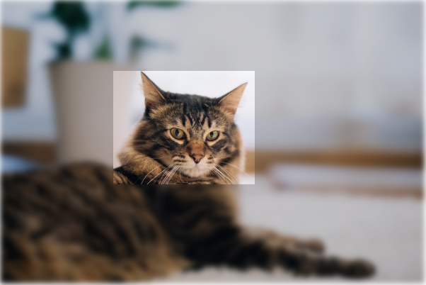
加工した画像と切り抜いた画像を重ねると目を引く演出ができます。
CSS下記にまとめて記述しています。
まず、画像をおきます。

<img src="https://www.kipure.com/img/demo/cat/011.jpg">普通の画像です。
次に切り抜きます。
<div id="demo_area1">
<img class="demo_img demo_clip1" src="https://www.kipure.com/img/demo/cat/011.jpg">
</div>
切り抜けました。
次に普通の画像を「filter」でぼかし加工します。
<img class="demo_img demo_blur1" src="https://www.kipure.com/img/demo/cat/011.jpg">ぼかしてちょっと暗くするといい感じになります。
それを重ねます。
<div id="demo_area2">
    <img class="demo_img demo_blur2" src="https://www.kipure.com/img/demo/cat/011.jpg">
    <img class="demo_img demo_clip2" src="https://www.kipure.com/img/demo/cat/011.jpg">
</div>
一部だけ加工したように見えます。
CSSはこちら。
.demo_img {
    width:300px;
}

#demo_area1{
    height: 300px;
    position: relative;
}

img.demo_clip1 {
    clip:rect(50px,180px,130px,80px);
    /* 上、右、下、左 */
    position: absolute;
}
img.demo_blur1 {
    filter: blur(2px) brightness(0.8);
}


#demo_area2{
    height: 300px;
    position: relative;
}
img.demo_clip2 {
    clip:rect(50px,180px,130px,80px);
    position: absolute;
    left:0;
}

img.demo_blur2 {
    filter: blur(2px) brightness(0.8);
    position: absolute;
}
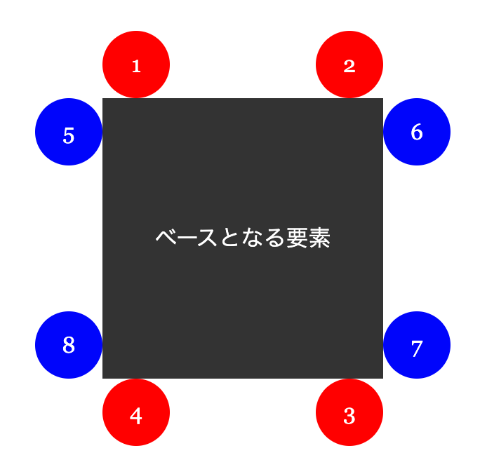
「clip:rect( A px, B px, C px, D px);」の意味を詳しく。
下地の画像の左と上が起点になります。
A : 上辺から切り取り面の上辺までの距離
B : 左辺から切り取り面の右辺までの距離
C : 上辺から切り取り面の下辺までの距離
D : 左辺から切り取り面の左辺までの距離
ちょっと覚えにくいですが、左上から時計回りに必要な数値を設定しています。
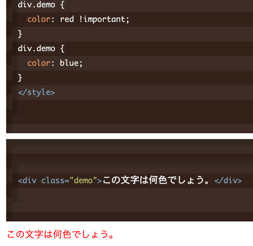
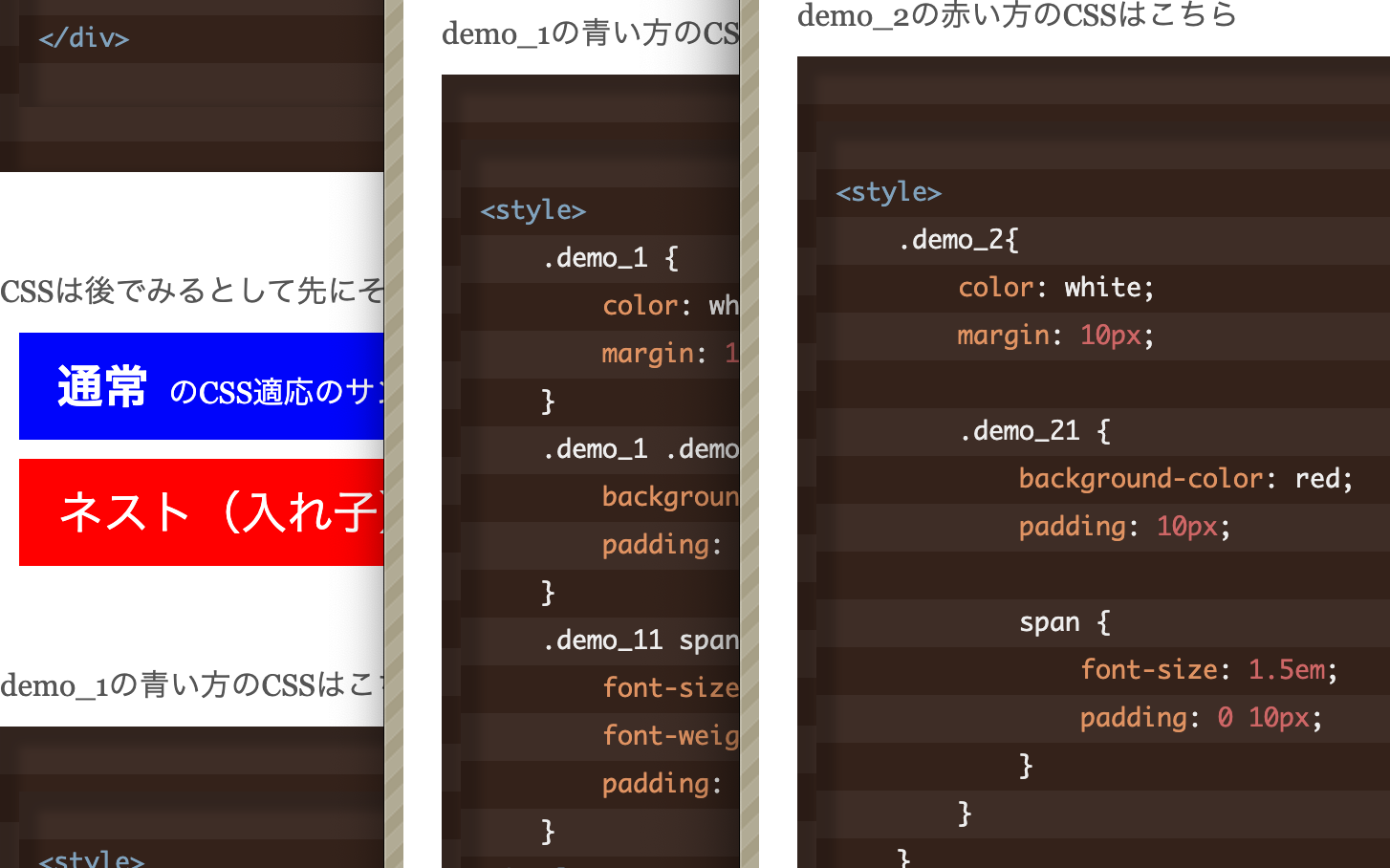