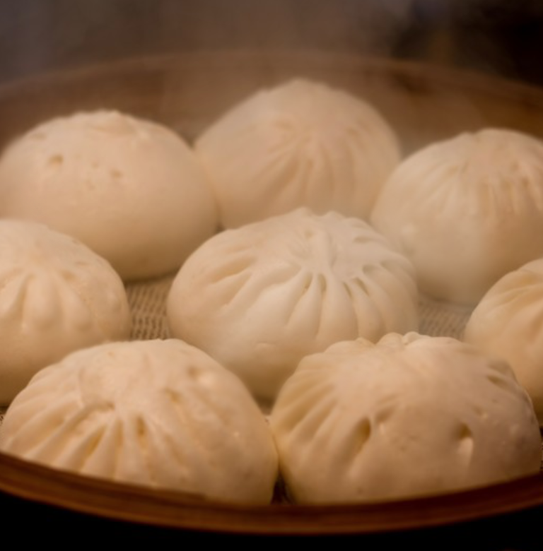
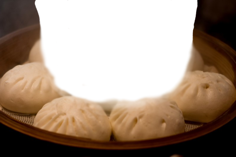
SVGの画像をCSSでアニメーションして、2枚の画像を使って湯気の表現を実装します。
この画像は3層になっています。
一番上に湯気の通り道だけ透明の肉まんの画像。
次に湯気のSVGが2つ。
最後に背景に普通の肉まんの画像が敷いてあります。

HTML
<div id="demo_stage">

    <div class="demo_steam"><img src="/img/article/196/yuge.svg"></div>
    <div class="demo_steam2"><img src="/img/article/196/yuge.svg"></div>

    <div id="demo_ue"><img src="/img/article/196/nikuman_ue.png"></div>

</div>
CSS
<style>
 #demo_stage {
    width: 600px;
    height: 400px;
    background: url("/img/article/196/nikuman_shita.jpg") no-repeat;
    background-size: cover;
    position: relative;
    overflow: hidden;
    margin: 0px auto;
}
#demo_ue img{
    width: 600px;
    height: 400px;
}
#demo_ue {
    z-index: 10;
    position: absolute;
}

.demo_steam {
    position: absolute;
    z-index: 2;
    top: 400px;
    left: 0px;
    animation: steam_up 20s infinite linear;
    transition: all 1s;
}

.demo_steam2 {
    z-index: 3;
    position: absolute;
    top: 400px;
    left: 50px;
    animation: steam_up 22s 10s infinite linear;
    transition: all 1s;
}


@keyframes steam_up {
    0% {
        filter: blur(10px);
        transform: rotateY(0deg);
        transform: scale(1, 1);
        opacity: 0.2;
        top: 400px;
    }
    13% {
        opacity: 0.2;
    }
    33% {
        opacity: 0.4;
        transform: rotateY(40deg);
        transform: scale(0.6, 1.2);
    }
    66% {
        transform: rotateY(2deg);
        transform: scaleY(1.2, 0.4);
    }
    100% {
        filter: blur(16px);
        transform: rotateY(50deg);
        transform: scaleY(1.4, 1.2);
        opacity: 0;
        top: -400px;
    }
}


@media only screen and (min-width: 0px) and (max-width: 960px) {
	 #demo_stage {
	    width: 300px;
	    height: 200px;
	}
	#demo_ue img{
	    width: 300px;
	    height: 200px;
	}

	.demo_steam {
	    top: 200px;
	    left: 0px;
	    animation: steam_up_sp 10s infinite linear;
	}

	.demo_steam2 {
	    top: 200px;
	    left: 25px;
	    animation: steam_up_sp 10s 5s infinite linear;
	}
	.demo_steam img{
		width:300px;
		height:300px;
	}
	.demo_steam2 img{
		width:300px;
		height:300px;
	}
}


@keyframes steam_up_sp {
    0% {
        filter: blur(10px);
        transform: rotateY(0deg);
        transform: scale(1, 1);
        opacity: 0.2;
        top: 200px;
    }
    13% {
        opacity: 0.3;
    }
    33% {
        opacity: 0.4;
        transform: rotateY(40deg);
        transform: scale(0.6, 1.2);
    }
    66% {
        transform: rotateY(2deg);
        transform: scaleY(1.2, 0.4);
    }
    100% {
        filter: blur(16px);
        transform: rotateY(50deg);
        transform: scaleY(1.4, 1.2);
        opacity: 0;
        top: -300px;
    }
}
</style>