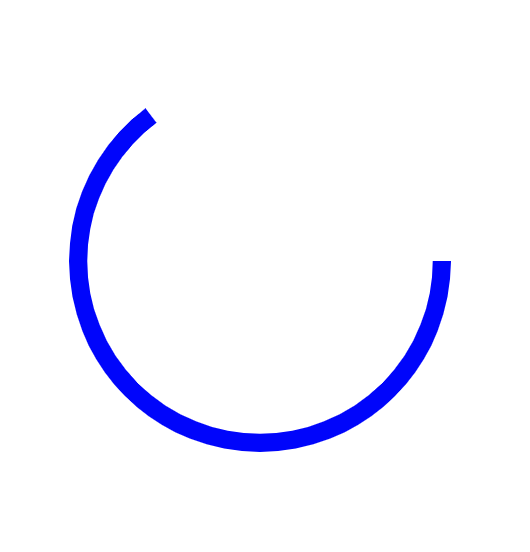
CSS3で手軽にアニメーションが使えるようになり、回転とループアニメを組み合わせると下記のような動きをつけることができます。
左右に回転するアニメーションも少し調整するといくつかバリエーションができます。
左に10度回転
@keyframes yure {
0% {
transform: rotateZ(0deg)
}
50% {
transform: rotateZ(-10deg)
}
100% {
transform: rotateZ(0deg)
}
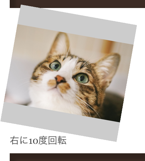
}右に10度回転
@keyframes yure2 {
    0% {
        transform: rotateZ(10deg)
    }
    50% {
        transform: rotateZ(0deg)
    }
    100% {
        transform: rotateZ(10deg)
    }
}
左右に5度回転
@keyframes yure3 {
    0% {
        transform: rotateZ(5deg)
    }
    50% {
        transform: rotateZ(-5deg)
    }
    100% {
        transform: rotateZ(5deg)
    }
}
余白をとると中心が下に移動します
@keyframesは3と同様です。
ちなみに画像のスタイルはこんな感じ。.yure_div{
animation: yure 1.5s infinite;
width: 200px;
height:200px;
overflow: hidden;
background: #CCC;
}
.yure_div img{
width: 100%;
top: 0;
left: 0;
right: 0;
bottom: 0;
margin: auto;
position: absolute;
}