スマホの左上や右上によく見かけるメニューボタンのサンプルです。
ハンバーガーメニューとも言われますが、そのボタンを押すとクローズボタンに切り替わります。
メニュー自体は実装してませんので、この演出を活用してページにあったメニュー表示を実装してください。
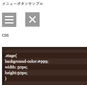
メニューボタンサンプル
CSS
.stage{
background-color:#999;
width: 50px;
height:50px;
}

.menu_toggle,
.menu_toggle div {
  display: inline-block;
  transition: all .4s;
  box-sizing: border-box;
  z-index: 999;
}
.menu_toggle {
  position: relative;
  width: 30px;
  height: 26px;
    left: 10px;
    top: 12px;
}
.menu_toggle div {
  position: absolute;
  left: 0;
  width: 100%;
  height: 4px;
  background-color: #fff;
}
.menu_toggle div:nth-of-type(1) {
  top: 0;
}
.menu_toggle div:nth-of-type(2) {
  top: 11px;
}
.menu_toggle div:nth-of-type(3) {
  bottom: 0;
}
.menu_toggle.open div:nth-of-type(1) {
  -webkit-transform: translateY(11px) rotate(-45deg);
  transform: translateY(11px) rotate(-45deg);
}
.menu_toggle.open div:nth-of-type(2) {
  opacity: 0;
}
.menu_toggle.open div:nth-of-type(3) {
  -webkit-transform: translateY(-11px) rotate(45deg);
  transform: translateY(-11px) rotate(45deg);
}

.menu_toggle[data-notice]:not(.open)::after{
  content:attr(data-notice);
  position:absolute;
  top:-10px;
  right:-16px;
  width:1.5rem;
  height:1.5rem;
  text-align: center;
  line-height: 1.8;
  font-size:0.9rem;
  font-weight:600;
  color:white;
  background:#fc0100;
  z-index:1000;
  border-radius:50%;
  border:#033a22 3px solid;
  display: block;
  text-indent: -1px;
  letter-spacing: 0;
}
JavaScript
$(function(){
  $("#menu_button").on('click',function(e){
    $("#menu_button").toggleClass('open');
  });
});
html
<div class="stage">
      <a class="menu_toggle" id="menu_button" href="#">
        <div></div>
        <div></div>
        <div></div>
      </a>
</div>